KPM Analytics Website
Owning the company website end to end in Webflow
UX/UI designer at KPM Analytics with 5+ years across websites, product, and internal tools. Based in Salt Lake City, Utah.
Salt Lake City, Utah
Owning the company website end to end in Webflow
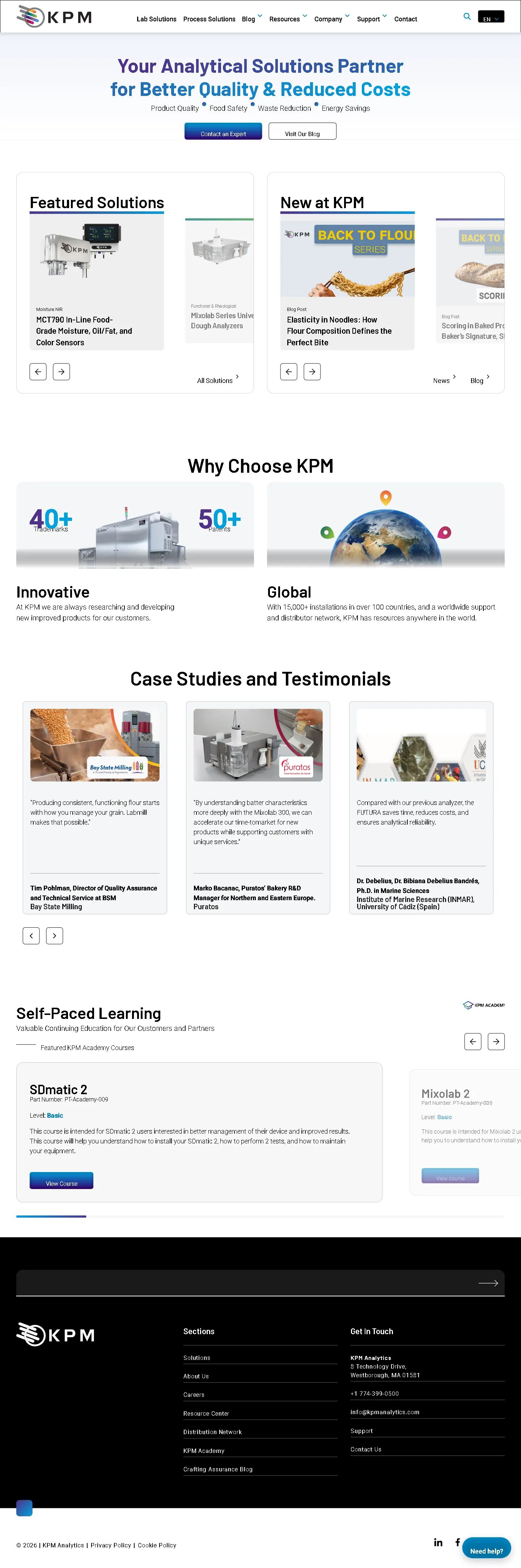
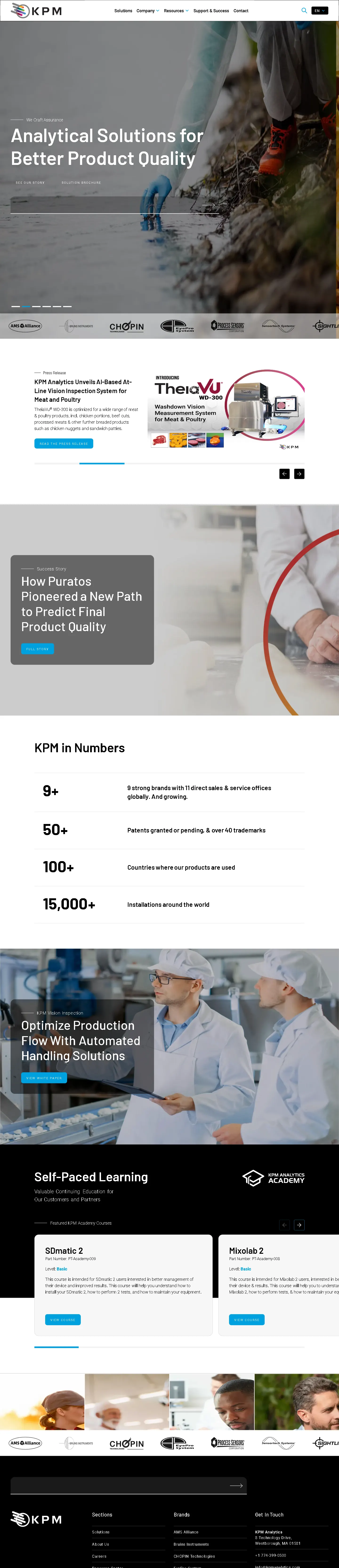
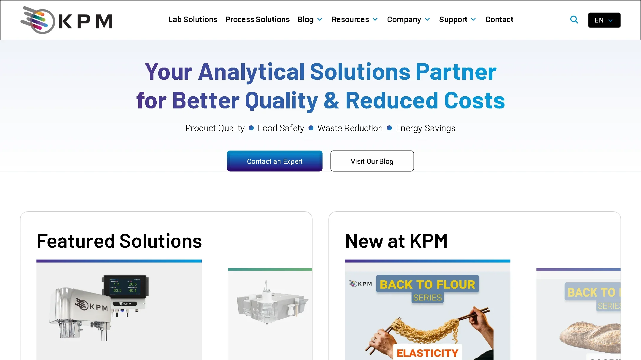
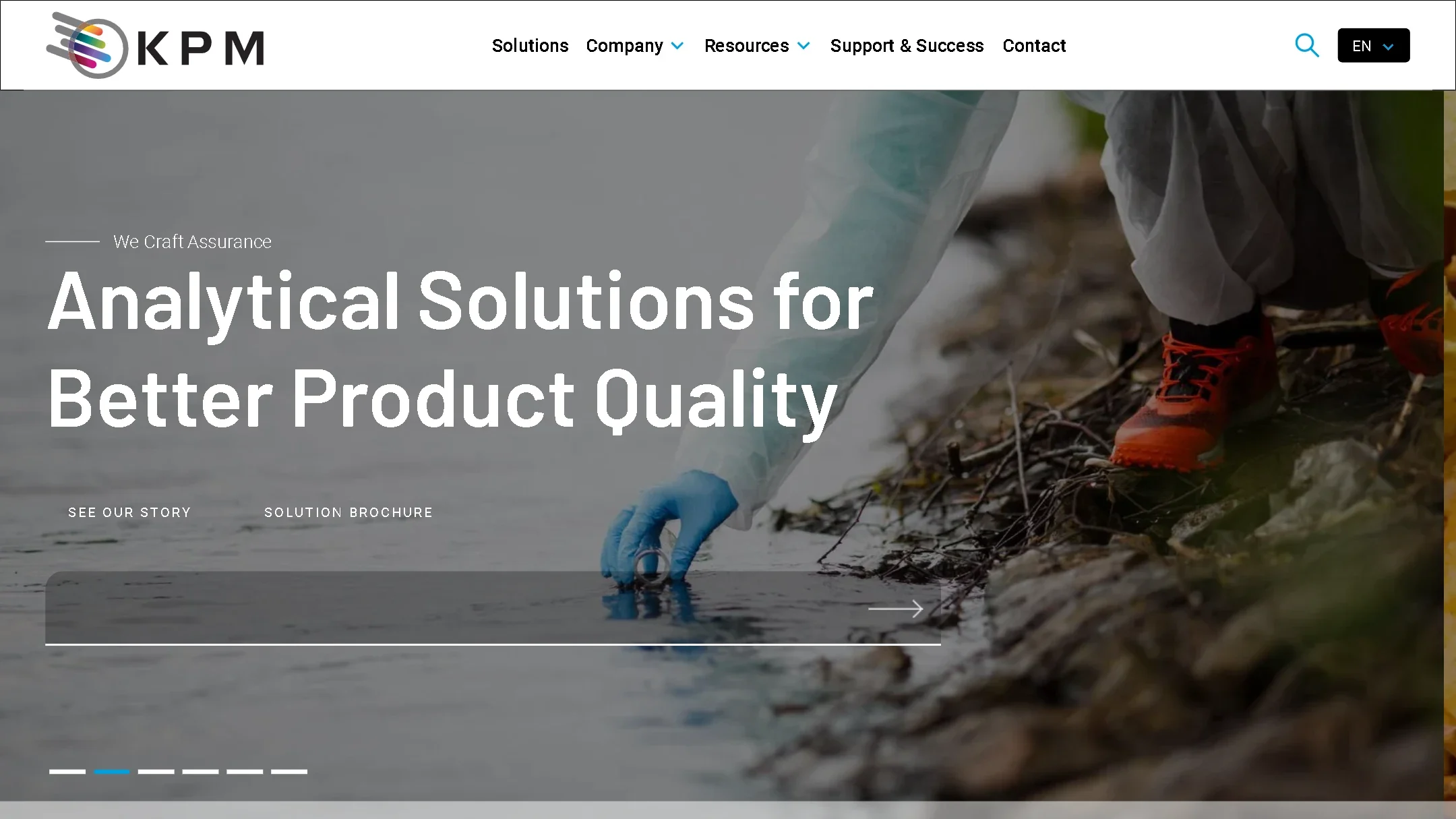
Each side scrolls on its own. Drag the handle to compare. Visit the live site ↗View the October 2024 archive ↗
I own the company website in Webflow end to end, from research and design through build and ongoing updates, and partner with an outside dev team on SEO.
~43%
Better average Google search ranking
12.6%
More search impressions, year over year
~50%
Faster mobile page load (LCP)
12%
More engagement time on organic visits
Led the redesign of the homepage and blog. [Add the problem it solved and the result.]
Helped build the team's design process, introducing A/B testing, a design system, and user research using PostHog, Microsoft Clarity, and Google Analytics.
Raised the share of mobile visits with good page load by 22 percentage points, and passed Core Web Vitals on desktop.
Designed landing page and social media templates that let marketing test ideas faster, and created sales tools and assets.
Partnered with engineering on UI work, and created AI skills to keep company use of Claude and other AI tools on brand.
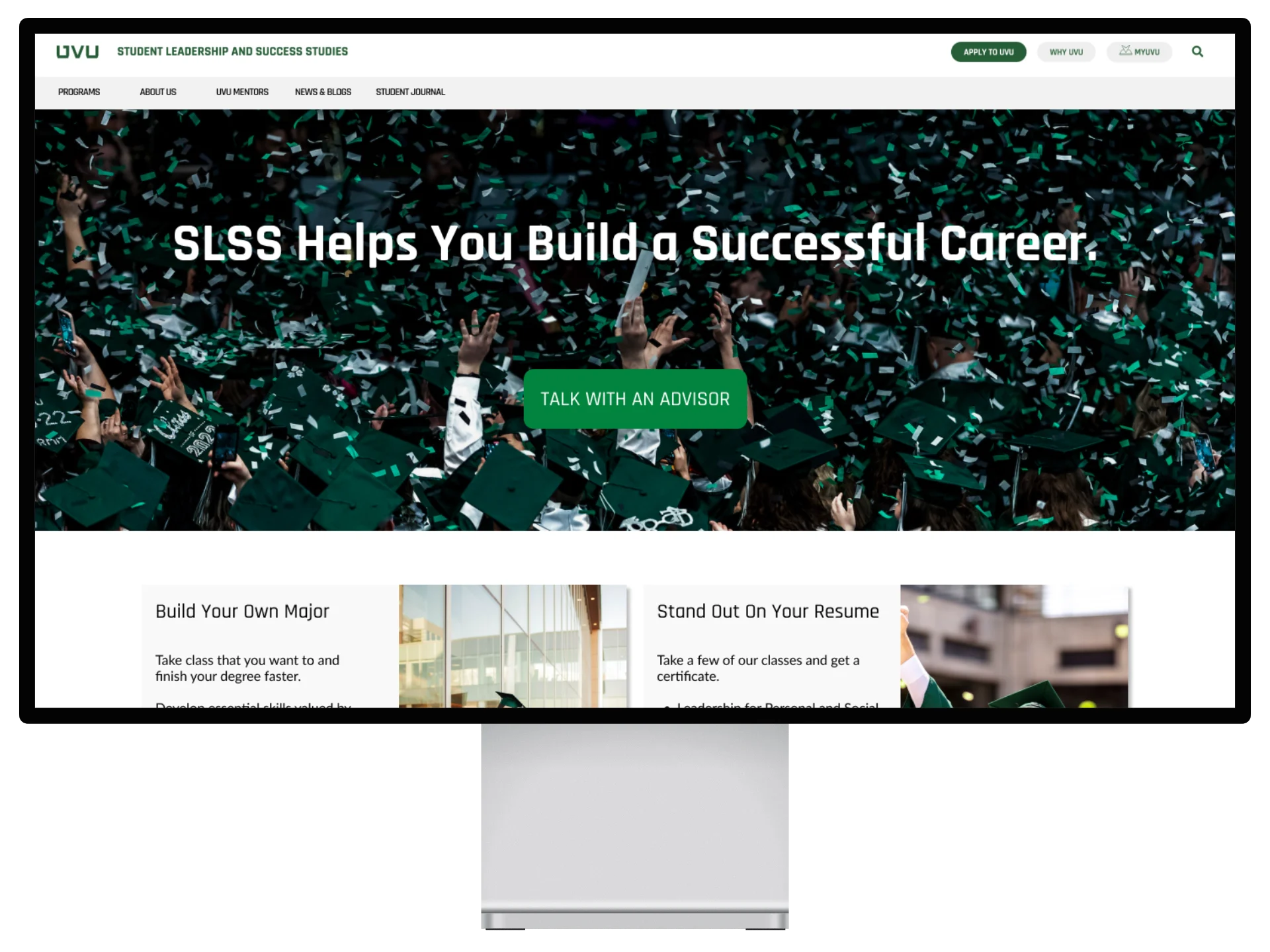
University department website design and research
UVU's Student Leadership and Success Studies department helps students learn soft skills for their careers, with classes in stress management, speed reading, and leadership.
We found they lacked a website that communicated the value of their degrees and classes. Most students who took their classes enjoyed them, but the department had no way to communicate that value to new students. We found school counselors were the best CTA, and making sure students knew the class numbers was the next most effective way to get them to sign up.
During the discovery phase, we ran research to gather insights and understand user needs. Here are some of our survey results.
52%
Had never heard of the SLSS department
Only 7% had learned about it from the website.
80%+
Enjoyed the classes they took
Top 3
Leadership, stress management, job placement
What students said mattered most.
From user interviews, questionnaires, and eye tracking, we found the site didn't tell users who the department was or why they should care about its classes.
Students had often heard of some classes, or even taken them, but didn't know the bigger picture. They tended to take only individual classes that friends or counselors suggested.
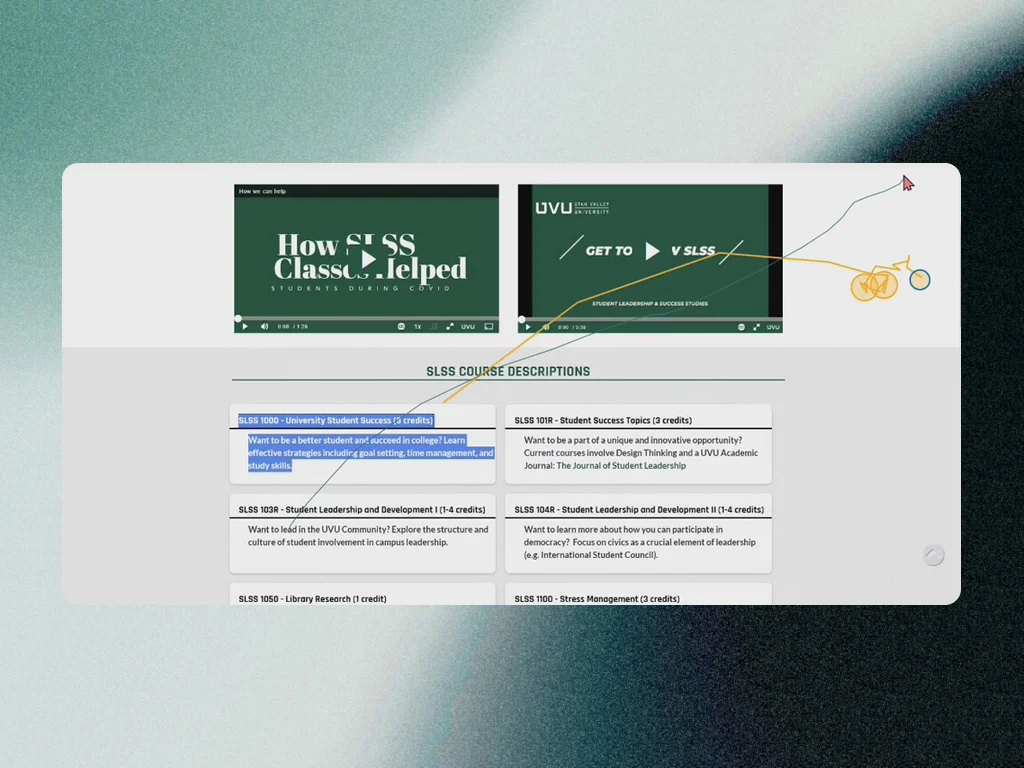
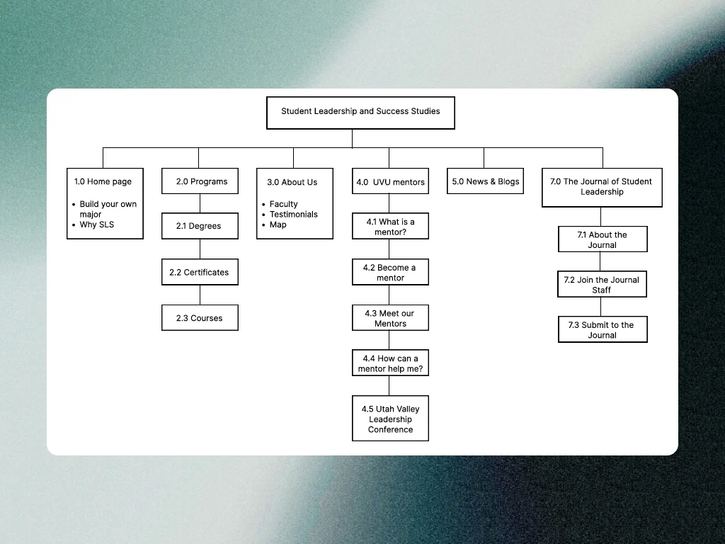
Once we had research insights and a clearer understanding of the requirements, we began designing in Figma. I was in charge of the home page wireframe: a larger header with a clear value proposition, and cards that show off the value of the department's most popular classes.
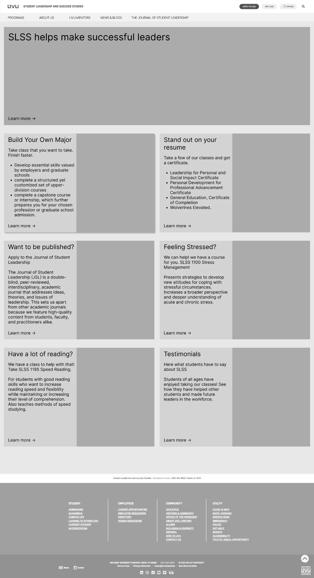
We decided the best CTA was to direct students to the counselors who often suggested these classes. To show off what the department offered, we made cards for the most popular classes, each with a tagline about why you'd want to take it.
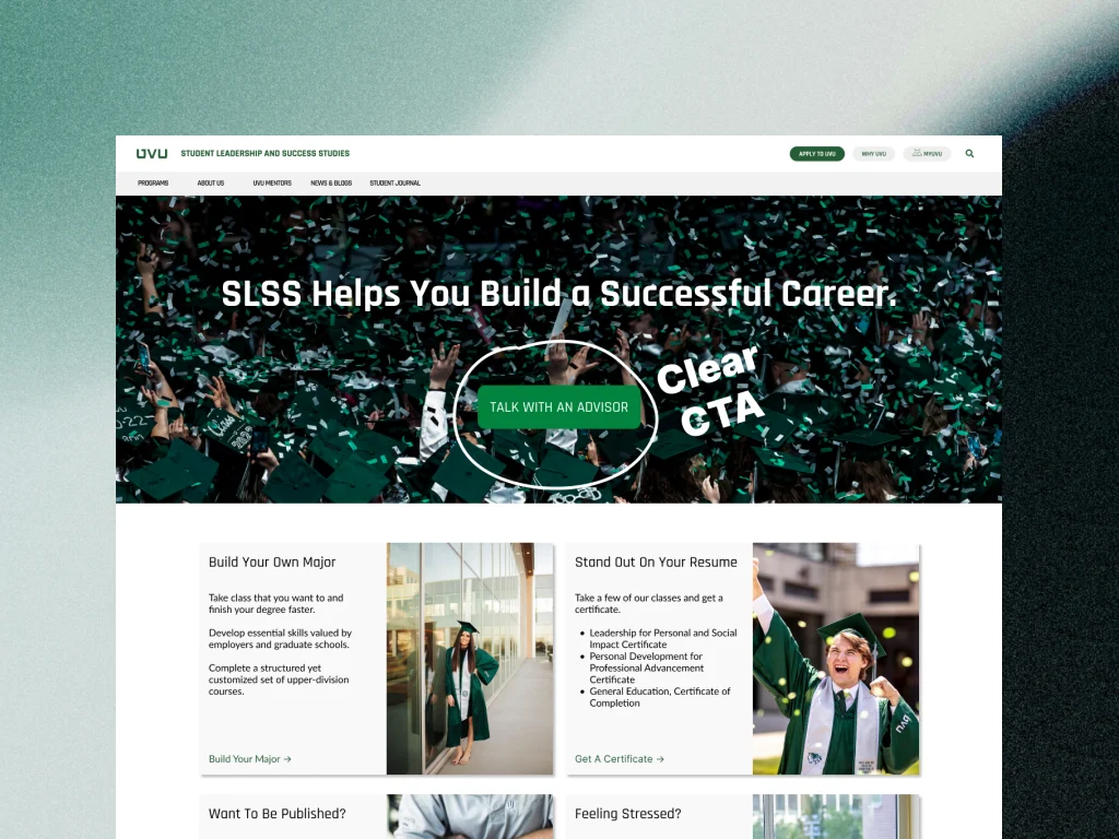
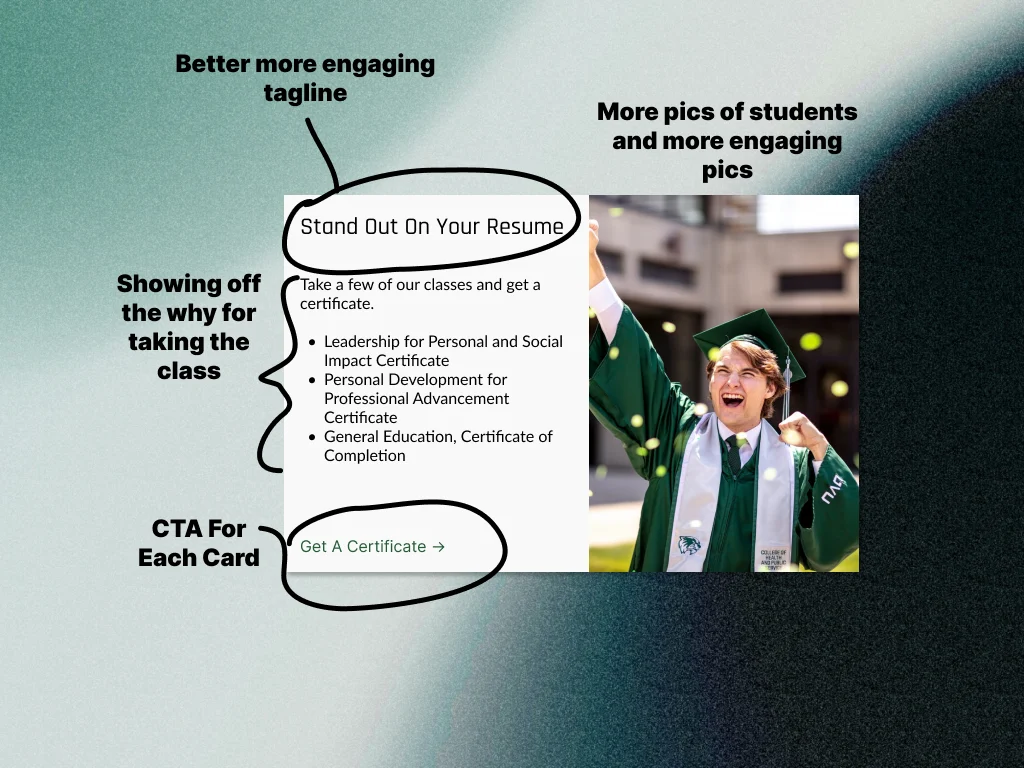

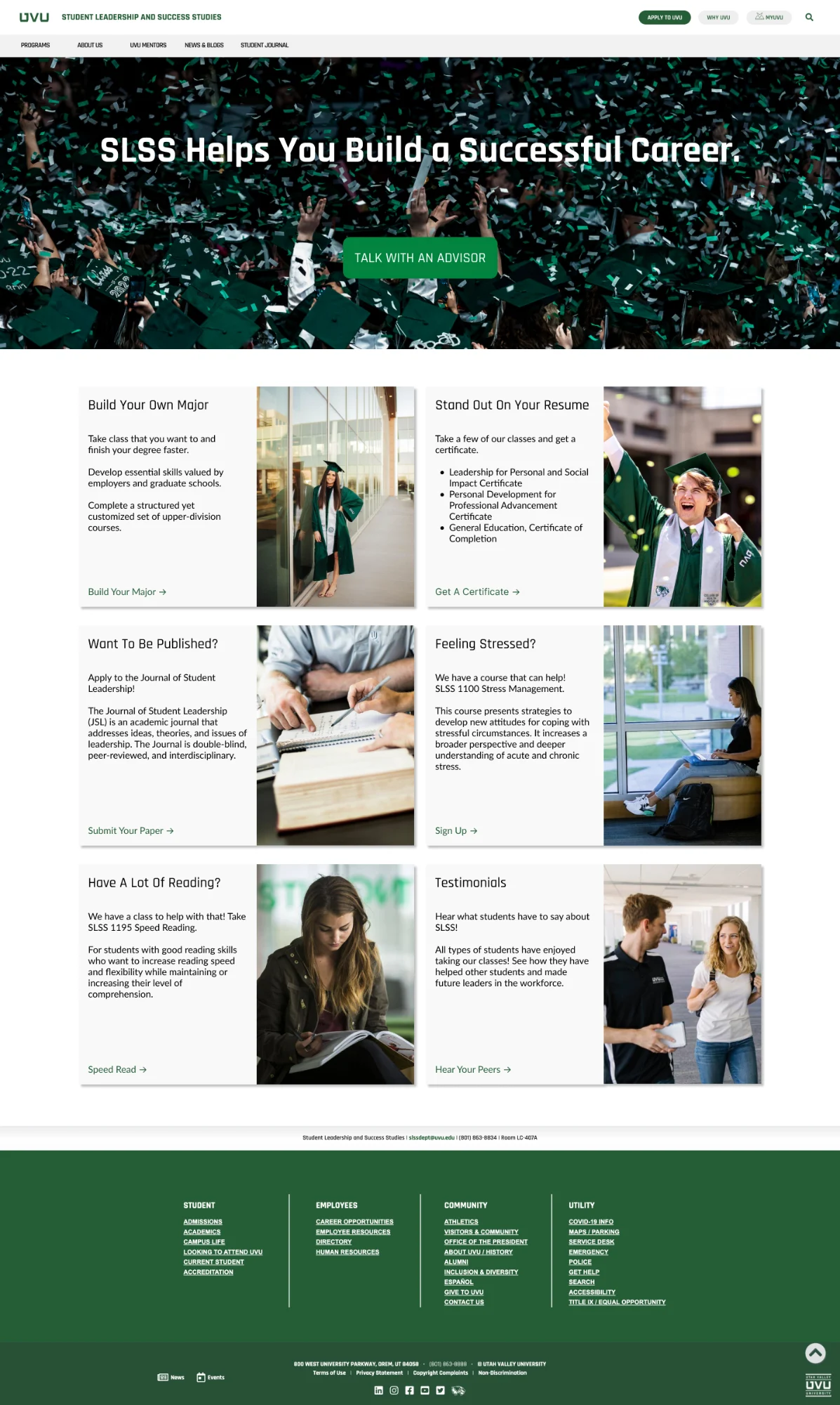
We presented to the department faculty and left them with all of our research, designs, and ideas in a handoff document. The site is being developed by students at UVU.
“Probably my favorite presentation. I really like how you used the data, the design of the site, the rationale, etc. Knocked it out of the park!”Faculty feedback
32%
Improvement to navigation
Students took less time to get around the page.
70%
Improvement to class selection
Finding why to take a class improved by over 70%.
121%
Improvement in counselor sign up
Students found how to book a counselor over twice as fast.
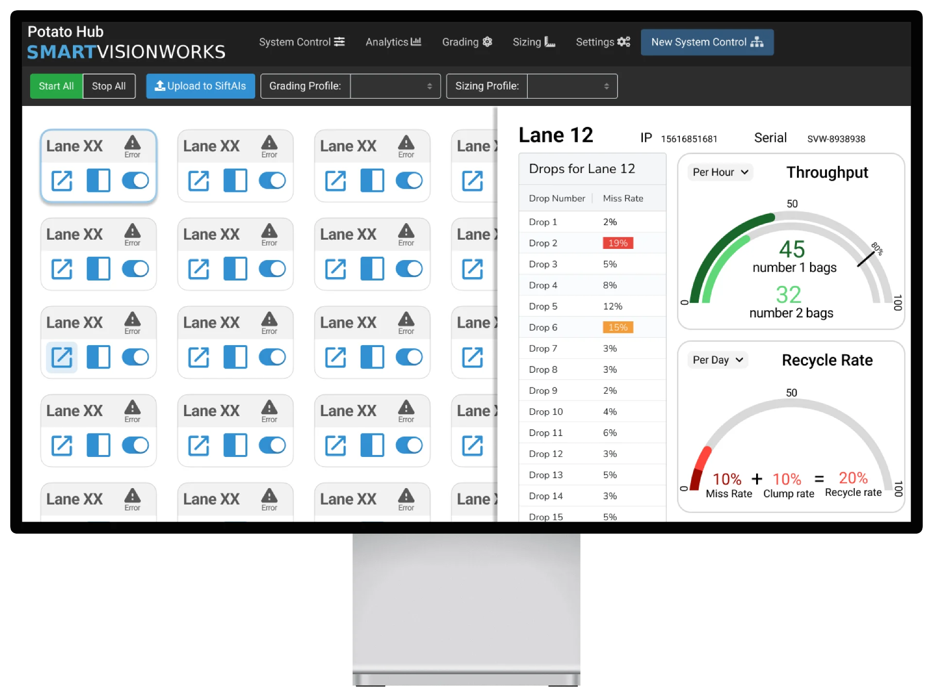
Enhancing developers' efficiency in creating consistent designs
Smart Vision Works is an AI food inspection tech company. I worked on UX, UI, graphic design, and more, alongside PhD experts in AI, machine learning, and manufacturing.
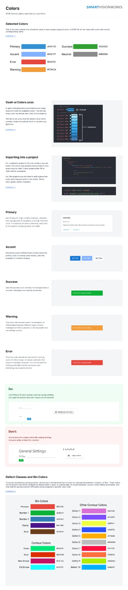
A content audit found over 34 different shades of blue, the company's primary color, in the code base. Developers had no quick way to find brand colors, so they spent extra time hunting or used colors that didn't fit.
I worked with other departments on official brand color documentation, and built a color system and SCSS file that sped up developers choosing colors by over 50%.
34
Shades of blue found in the code base
50%+
Faster color choices for developers
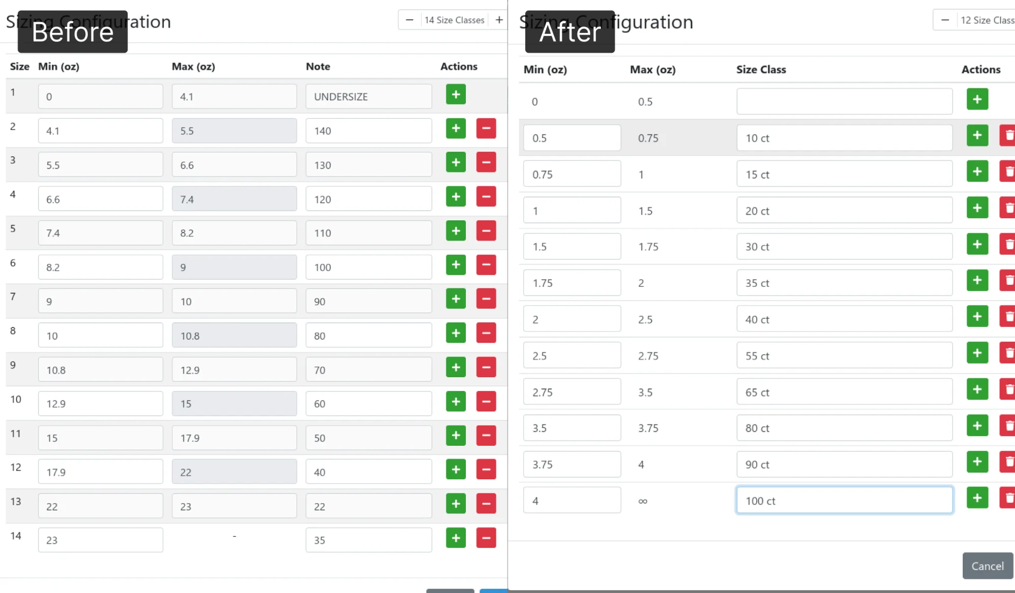
During a usability study I found a table design that was causing a lot of dead clicks: users averaged 4 per use. After the redesign, dead clicks dropped to zero.
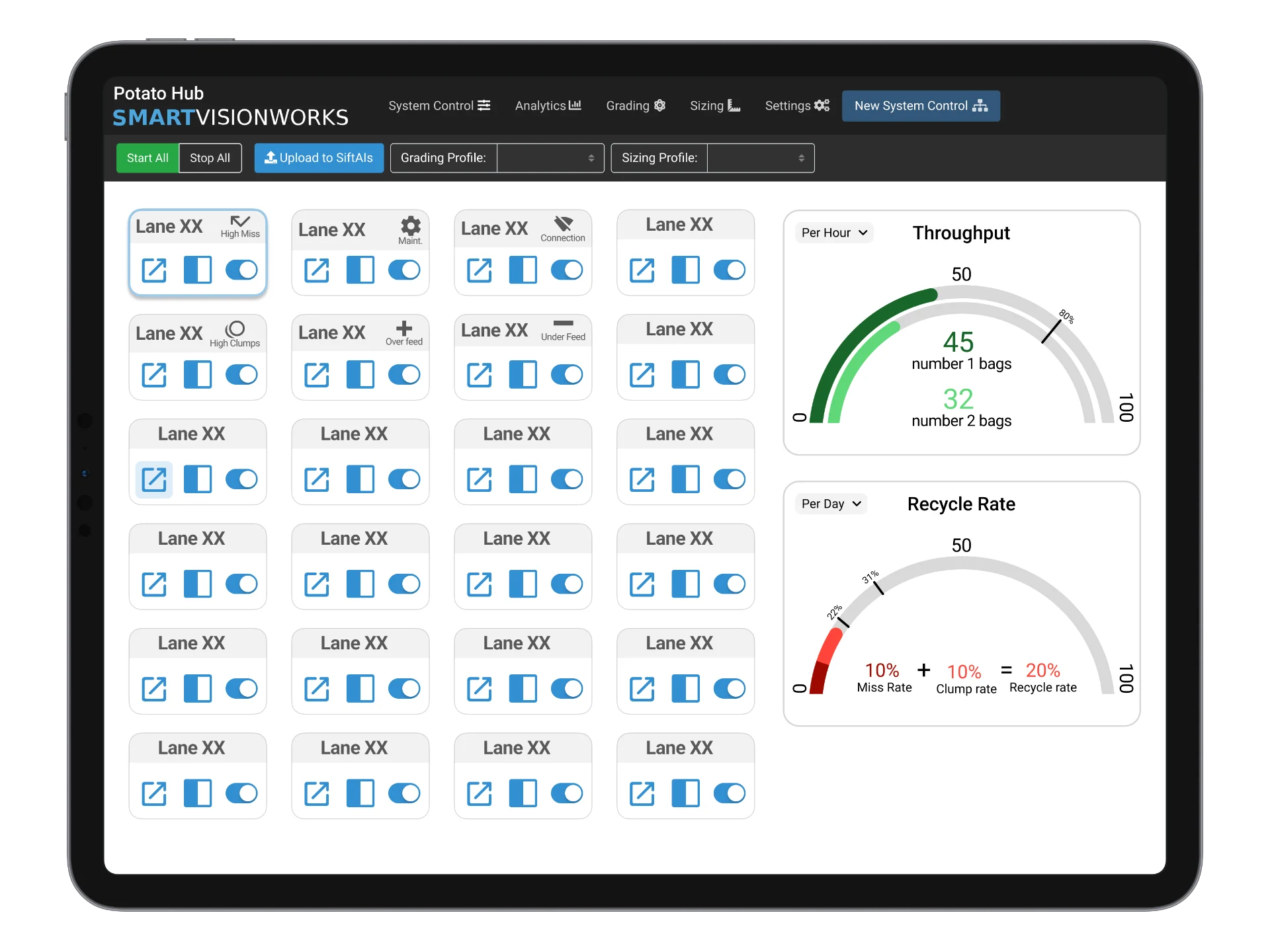
I worked with developers and managers to create a complete design for a new version of one of the SVW products. Adding Figma to the process let stakeholders get much more involved, and kept designs consistent with the design system.
Kaden is easy to work with, is organized, communicates well, and has all the characteristics one would hope in a UX designer.

Emily Hedrick
Assistant Professor of Digital Media
 UVU

[One-line description]
[One-line description]
Add a short description of this project: what it was, your role, and how it turned out.
Kaden is an excellent designer who really tries to understand the customer's perspective.

Casey Merrill
Software Engineering Manager
 Smart Vision Works

[One-line description]
[One-line description]
Add a short description of this project: what it was, your role, and how it turned out.

[One-line description]
[One-line description]
Add a short description of this project: what it was, your role, and how it turned out.
[One-line description]
[One-line description]
Add a short description of this project: what it was, your role, and how it turned out.
Kaden has a great work ethic and eye for what's missing or needed.
He's reliable and the kind of employee I could put on any task.

Sarah Prince
Customer Support Integration Manager
Smart Vision Works
[One-line description]
[One-line description]
Add a short description of this project: what it was, your role, and how it turned out.
A personal tool for chipping low poly rocks and gems
I kept needing low poly rocks for illustrations and 3D scenes, and modeling each one by hand was slow. So I built a small tool that lets me chip them into shape the way you would a real stone.
Every rock starts as a block. A seed number cuts natural fractures into it, so the same seed always gives the same stone. Click an edge and a chip flies off; drag to turn the stone and work on another side.
Sliders set the size, thickness, number of fractures and how big each hammer strike is. Undo takes back one chip at a time, and Shuffle shows six more stones with the same settings.
Stone mode gives flat, illustrated faces with an outline. Gem mode adds transparency, frost, shine and a little chromatic aberration on the bright edges, so the same shape can become a polished crystal.
The tool is one HTML file with no libraries. Everything is drawn as SVG, so a stone can be copied straight into Figma, saved as an SVG or a 2048px PNG, or exported as an OBJ model for Blender.
Draft text: edit it to tell the story in your own words.
Hire me, work with me, or just say hi.