Design to Improve Class Sign Ups
UVU's Student Leadership and Success Studies department is focused on helping students learn soft skills for their careers. They offer classes in stress management, Speed Reading, and Leadership.
we found they lacked a website that communicated the value of their degrees and classes. Majority of students who took their classes enjoyed them but they lacked ways of communicating that value to new students. They had recently started a new marketing campaign and this website need to be a better way that would guide visitors to sign up for their classes. We found school counselors were the best CTA and making sure students knew the class numbers was the next most effective way to get students to sign up for their classes.
Research and Analysis
During the discovery phase, extensive research was conducted to gather insights and understand user needs. Here is some of our survey results
Low Recognition
52% of students had never heard of the SLSS department. Only 7% of people had learned about the department from the website.
High Satisfaction
When Students took classes from the SLSS depart over 80% enjoyed the class
What Is Important
Students reported that leadership and stress management were there biggest priorities with job placement
Insights - Users Didn’t Know Who They Are or Why They Should Care
From user interviews, questionnaires, and eye tracking we found that the site didn’t tell users who they were or why they should even care about taking their classes.
We found that students had often heard of some of their classes or had even taken them but didn’t know the bigger picture that was the department as a whole. Students seems to take only individual classes that friends or counselors had suggested to them
Ideating
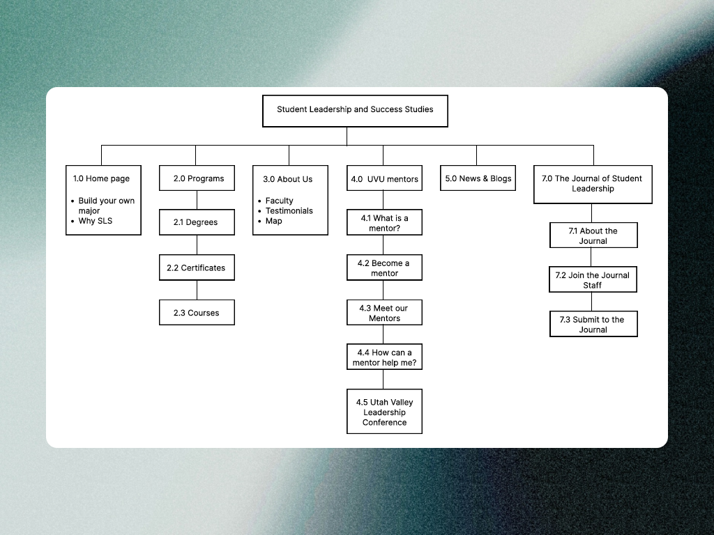
After we had research insights and a clearer understanding of the problems facing the SLSS and the requirements of the project. We began designing in figma
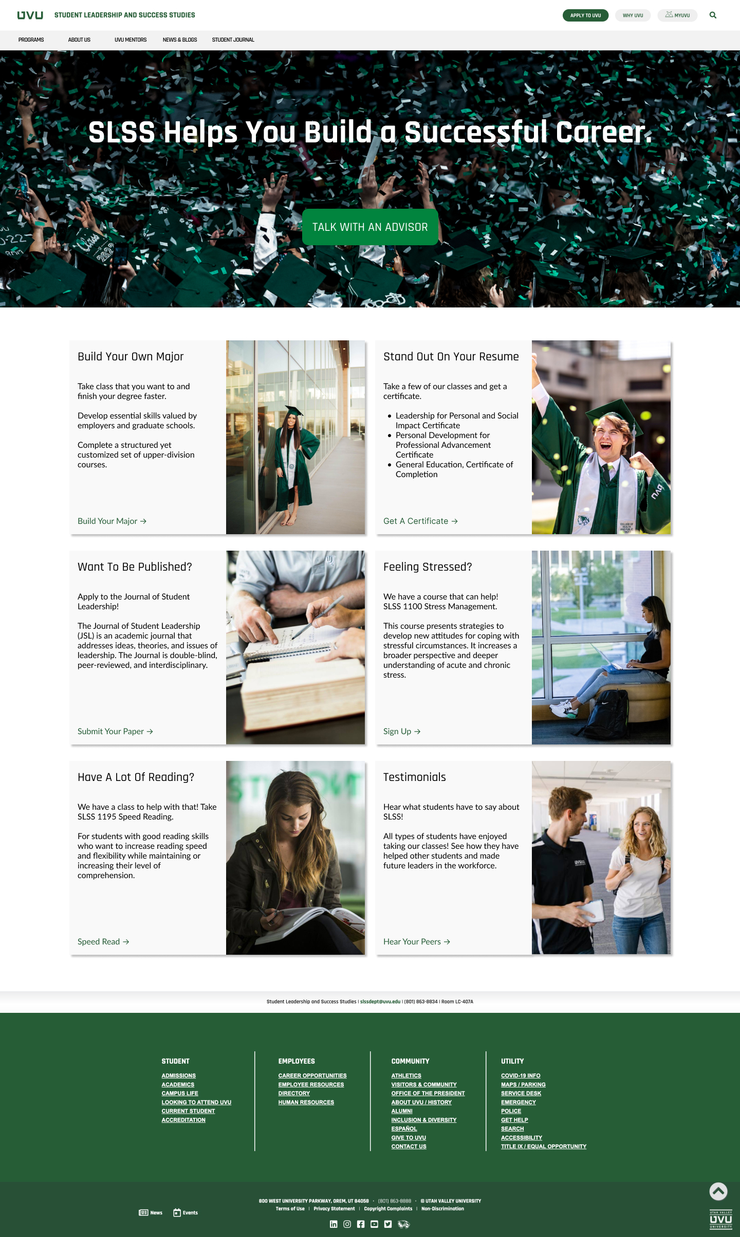
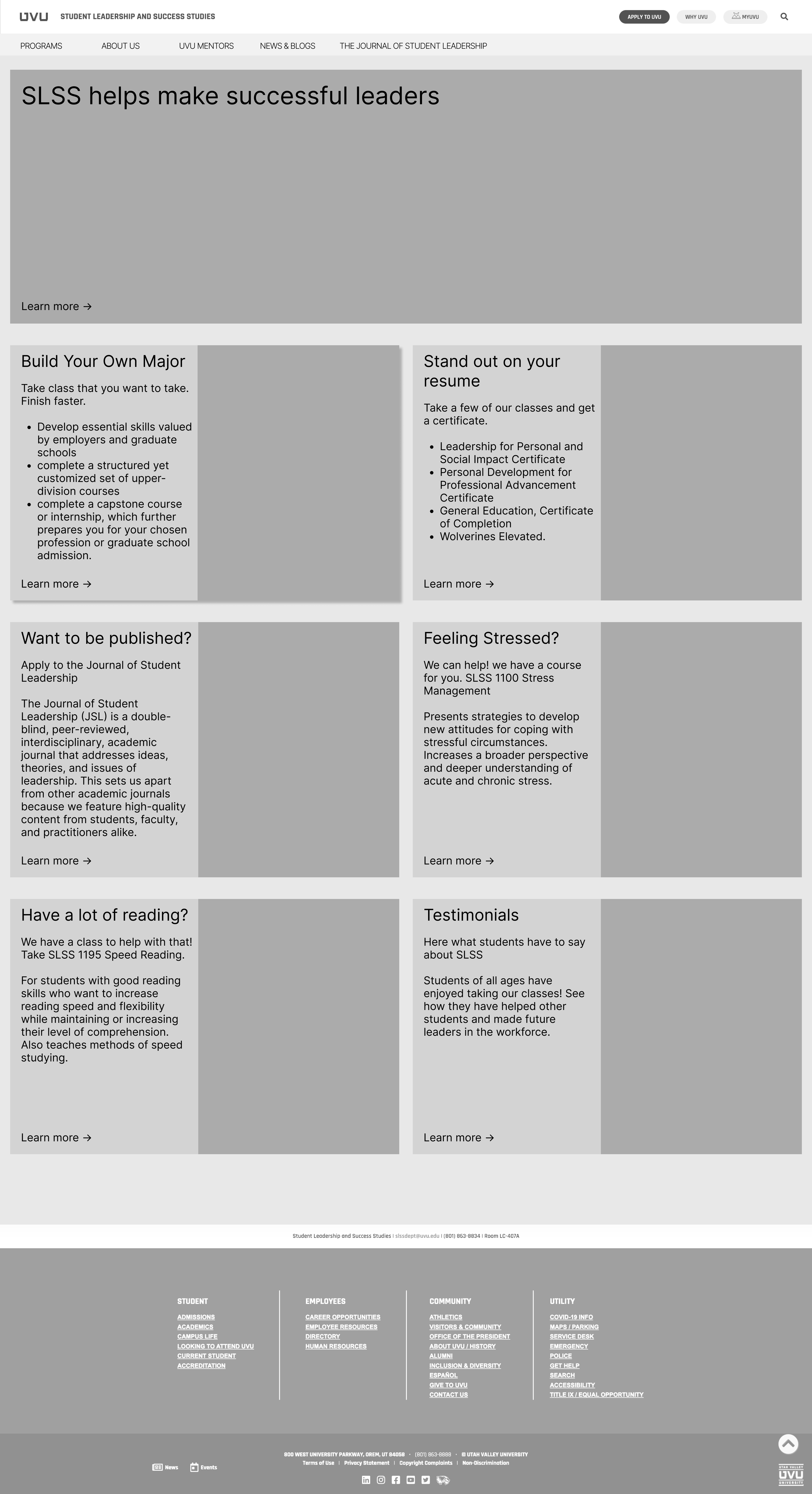
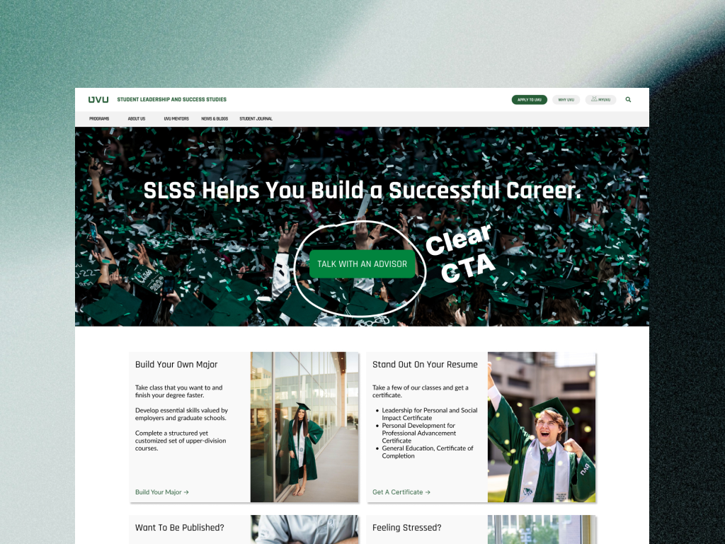
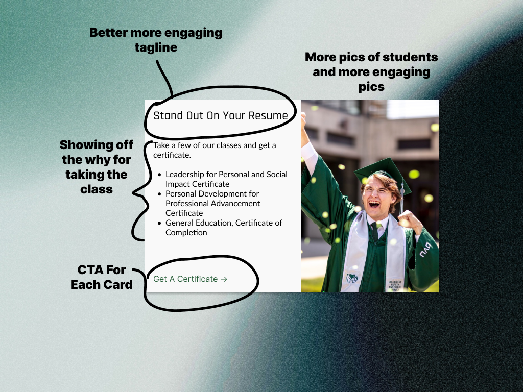
Here is one of the wireframes from the home page which I was in charge of designing. I wanted to make a larger header with a clear value proposition and then each card or sub heading to focus on displaying the value of some of their more popular classes.
Game plan - better call to action and show off what they have to offer
We decided that the best CTA for the site was direct them to the consolers who often suggested their classes such as career exploration and stress management
To show off what they had to offer better we decided to make cards displaying their most popular classes and add taglines about why you would want to take the class.
Pitch to the Stakeholders
We presented to the department faculty and got some great feedback about our designs. This site is currently being developed by some students at UVU. We also left the department with all of our research, designs, and ideas in a handoff document.
"Probably my favorite presentation. I really like how you used the data, the design of the site, the rationale, etc. Knocked it out of the park!"
Results
32% Improvement to navigation
We found that students took less time to navigate around the page in our new design.
70% Improvement to class selection
Students given the task to find why a class they wanted to sign up for improved by over 70%
121% Improvement in counselor sign up
We found students were able to find how to schedule an appointment with a counselor over twice as fast